The image below is the gant chart or schedule for the activities I have been involved in for the last 8 weeks. Primarily I was involved with the design process which included merchandise and logo creation.
Andy and myself thought it would be a good idea to come up with some Ravensbourne related merchandise that could fund our project. We had to decide whether or not people would buy the T- shirts. After all we had to make a profit by the end. The group as a whole felt that it would be a good idea to promote the college to come up with some designs that students could also relate to. Many of us, myself included thought that the third nexus designs looked good in a design sense. However, we had to think why people would buy these shirts. Who would go and buy some t-shirts that they could not relate to. The company was more a theoretical campaign at this stage so it was unrealistic to believe students would by into a fictional business.
To rectify this problem we believed it would be necessary to create some Ravensbourne related designs that promoted the college as well as their creative talents. Below are some designs that I produced in photoshop. While designing the shirts and hoodies I tried to adhere to the current Ravensbourne logo and penrose shapes. I must say that coming up with decent designs using the college logo was hard. However, with a little ingenuity and observation I came up with some shapes and designs that could be used effectively.
Although none of my designs were viable they kick started some ideas throughout the group. After talking with Jill Hogan we managed to find some common ground and finally settled on a design. This could then be produced cheaply and advertised to students.
Below are some designs I produced using Maya and Photoshop. These were just merchadise tests to get an idea of what the logo would look like on some pens.
The images below show the development from model to final composite with lighting setup.
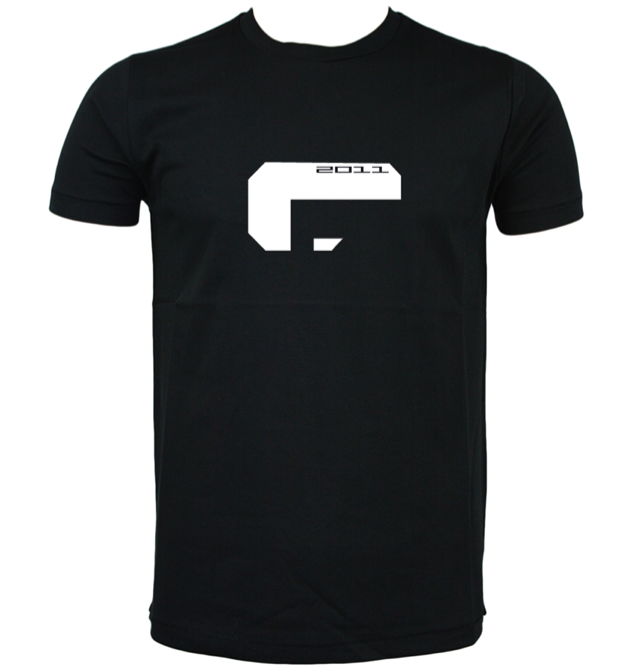
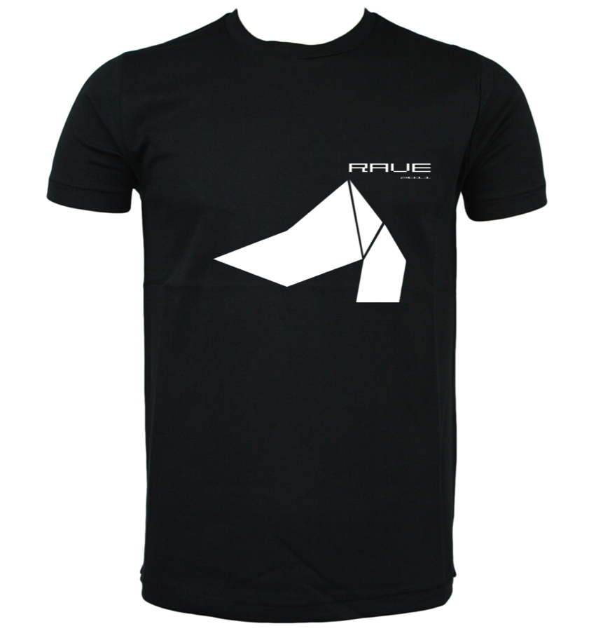
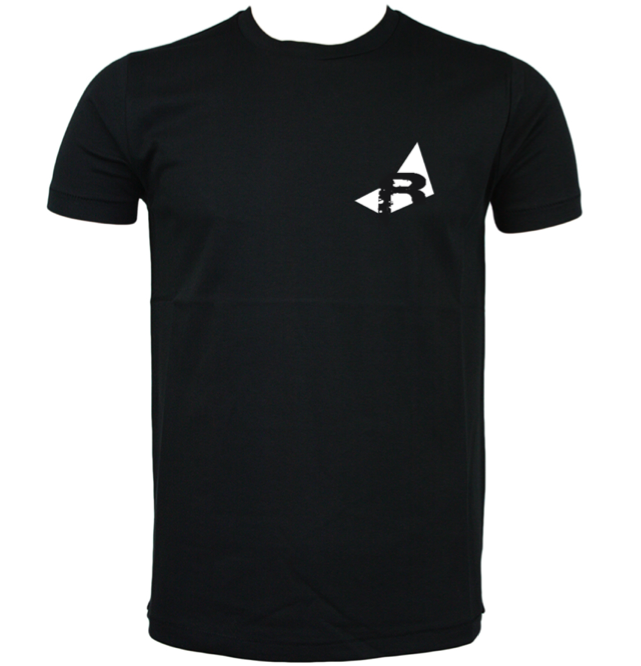
Below are some very early t-shirt designs for the company Logo. I tried to use very simple shapes and text to visually explain the company. I tried to keep the designs simple but considered which would also reduce cost when producing the shirts. I decided to go with a limited colour palette that would lower cost and would appear more dynamic and streamlined to the consumer. Once the designs were completed we set about doing some market research to see whether people would by into the product.
Andy had a cool idea where we would sell Ravensbourne t-shirts to fund our project. Andy and I have already done some designs for the t- shirts but we need to refine them a little.
I proposed that we would have some kind of logo on the front that says "ravenous" which means hungry. This could also be interpreted as hungry for creativity which is what Ravesnbourne is supposedly all about. Il do some designs, if anyone has any cool catch phrases or wordage that could go on the back this would be awesome.
Just to re iterate this will go hand in hand with our current e and e project. This will be our way of making some sort of collateral by the end, which could fund our website. Rather than having a t-shirt that says the third nexus which noone has any clue about, why not create a shirt they can relate to. This may spark more interest and better profit margins. If anyone has any better suggestions, expose them please.
Below are some three dimesional logo designs created in maya and rendered using mental ray. The objective here was to produce a design which would best describe the company as well as the creative students it will support. I tried to come up with dynamic and modern designs that would best represent the college. The idea was that these images could be used on the home page of the website.
In some of the later designs I tried I added a light rig that could later be animated to reveal the logo but would also relate to the large broadcasting cohort within the college.
Here are some very early 3D logo designs created in Maya. These designs were still in their infant stages, however they could later be adapted and worked on to best suite the needs of the whole business. I created these images quite quickly and the idea was to produce as many ideas as possible so the group could decide which one they liked best.
Once we settled on a specific design we could then focus on refining it and adding the logo to the merchandise. Again, my efforts were primarily focused on creating a logo that was simple yet modern which could possibly relate the college and its students.